Simplicity in Design
2012 has been the year of simplicity in the world of web design. Several well–known outfits have jumped on the bandwagon. The result is variable, but with some very good points to it.
So we’ve decided to play follow–the–leader and do a very thorough rewrite of the styles for our corporate blog. The focus for the redesign has been to simplify and improve readability. As always we’ve kept accessibility in mind.
A Note on Technology Choices
We’ve had some questions asked as to why we don’t use HTML 5, or, more precisely, the “living HTML” specification. At this point in time, we are of the opinion that there are too much uncertainty associated with this new development of HTML.
Not only is the process criticised, but the specification itself contain numerous questionable details right now — in particular related to accessibility. Discussions on this topic can be easily located through the W3C mail archives.
Add to it that there are few new widely supported features which we can make use of, and so we decided to stick with HTML 4.01 Strict. Granted, there are several new structural/semantic elements of which we could make use, such as SECTION and ARTICLE. At the same time there is <B>, a topic on which one could write entire books.
To Remove or Not Remove
To start with, we acknowledged that priorities differ between what is essentially a company information site such as http://www.greytower.net and a content–oriented blog.
Up until now blog.greytower.net has been using the same layout and structure as the corporate website — including a somewhat fancy menu built using HTML’s UL–element with a good portion of CSS 3 for the unusual look of the individual items.
We have found this to work well on the main site, with a gentle colour scheme and careful use of the transition property to supply visual feedback.
The blog, on the other hand, is all about the content. Articles posted here will be fairly long, and we’d like the reader to focus on the reading. Do we need a large logotype and menu? Skip links? We’ve decided “no”.
Other items fall into the same category. We used to have a list of the most recent articles on the left–hand side — after the article in a linear, non–visual context — and various links in the footer.
In the end we decided to:
- Remove the logotype entirely. The URI says it all, really.
- Replace the menu with a link in the footer, pointing at the corporate site.
- Replace the “Most Recent” menu with a link to the blog archive.
- Remove the “Skip to content” and “Skip to footer” links. The content start right there, at the beginning; no skipping is required — and there is only one low–importance link in the footer.
- Keep both the published on and built on dates. Nothing annoy a reader as much as never knowing when an article was written! We’ll add an updated–field as soon as possible.
We did, however, take a good piece of advice and changed the format of our dates to a more readable one.
Subtle and Relaxed
Once we had cut external structure to the bone, we took a look at the visual design and typography — and quite naturally began with the overall colour scheme.
We have, for a long time, used the high–contrast combination of black text on a white background. As we always aim to meet with WCAG 2 at the “AAA” level, this is a good choice — the W3C luminosity algorithm give us a value of 21.0:1 for these colours.
Over the last few years some arguments have surfaced against such high contrast. In particular, various research, both formal and informal, into dyslexia suggest that a slightly lower contrast will be beneficial.
In addition, modern monitors are quite simply better, and it is easy to overdo contrast if turned up high.
Some users also feel that a clear white background is wearing on the eyes. With these details in mind, we decided to change — and simplify – the colour scheme. All values are in 8bit hex triplets.
- Main text body foreground is still pure black: #000000
- The background is a yellow/grey colour: #EEEFD7
- Preformatted text, exclusively used for code samples, are set on a white background.
- Link text is black, with a slightly grey underline: #BCB8B8
- On hover, the link underline turns red: #C60000
In addition, each level two header (H2) has a decorative blob of colour, created by adding a curved border and shadow in green (#338100) to the left hand side, with an opacity setting of 0.25. The same style is repeated in the shadow of images included as illustration.
For the text body, this yields a contrast of 17.96:1. Hopefully this combines the various requirements and makes our articles more pleasant to read for all concerned.
Typography
Typography on the web is tricky business, and we cannot lay claim to being experts. Still, we have tried to get a few things right — or as right as is likely possible. As Robert Bringhurst write, in his The Elements of Typographic Style:
If you use this book as a guide, by all means leave the road when you wish. That is precisely the use of a road: to reach individually chosen points of departure. By all means break the rules, and break them beautifully, deliberately and well. That is one of the ends for which they exists.
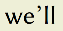
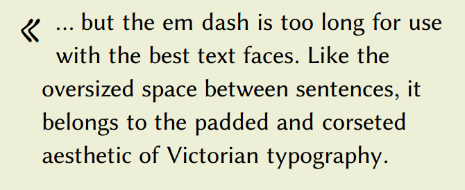
Hopefully we have succeeded in our goal: to improve legibility. It is likely that some will disagree, for example with our use of the em dash as a phrase marker. Robert Bringhurst again:
… but the em dash is too long for use with the best text faces. Like the oversized space between sentences, it belongs to the padded and corseted aesthetic of Victorian typography.
On the web, however, the very best text faces are few and far between. We much prefer using an em dash to open up sentences which, due to their structure, would otherwise be compact and tense.
Also rare are high–resolution monitors. Most commonly available desktop computers are at the 72 or 96 DPI level; a fraction of what is used to print on paper.
Types and Faces
Much research has been done on the old claim that typefaces with serifs are better than those without, on paper or on screen. As the case stands, the for and against are about equal.
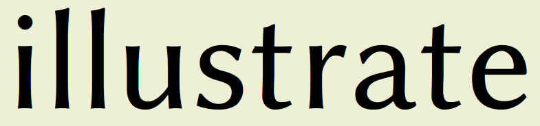
To us it makes the most sense that low–resolution displays will do better without serifs. We have chosen Linux Biolinum, a freely licensed typeface, for the text body.
For headers we make an exception; these are set in the art–deco inspired HiLo–Deco face. There is no particular reason for this choice, save that we really like the look.

The Readability of Italic
Italic types can be hard to read on low–resolution monitors, in particular if one’s eyesight is different from the norm. Several traditions make use of the visual clue inherent in an italic text. Emphasis, for example, is often set this way.
To improve readability, contrary to many strong opinions, we add letterspacing — typically one pixel wide — even to lowercase letters, but only in limited cases: bold and italic text, headers, and superscripts.

The latter is also gently lifted up from the text base, but not so much as to push up — and down — against the line above.
Quotations
’tis a tangled web, is quote marks — and we have been tempted to play with the Norwegian style of outwards–pointing double guillemets.
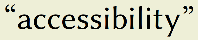
In the end, seeing as the blog has an international audience, we decided to stay with the British style of raised and inverted double comma.
Apostrophes are included as a single close–quote character.
A Question of Ellipses
Several years ago the author spent some time in the RNIB offices in London, and had a chance to test various assistive technologies. Upon listening to an article read from the then company website, it quickly became clear that ending a sentence with three dots (…) was a Very Bad Idea — they were read as one would expect: “dot dot dot”.
These days we use Tetropy to process content into markup, and it replace such sequences with the proper horizontal ellipsis character from Unicode.
Blocks of Quote
Block quotations have always been a complicated business. Not only has the BLOCKQUOTE element been subject to continuous abuse, but a common practise has been to set the content in a small, italic font — we’ve done the same for a long time.
This style, while looking very nice in print, works poorly on low resolution monitors and create problems for some partially sighted people. Yet the need to visually separate sections of quoted text from the surrounding content is not going away.
Structurally, using BLOCKQUOTE is appropriate as a browser can then present the information in a suitable manner; Braille, speech, and so forth. Most graphical user–agents have no such ability.
Once more we’ve taken a leaf from Robert Bringhurst, but adapted it to our own context. First, we reduced the font to 75% of the user’s norm. This, too, is controversial but we hope that it is not a direct hindrance.
Secondly, we shrunk the lines to 50% of the container, and used CSS’ generated content feature to add a left–pointing guillemet in the French style to the beginning of each quote. This character alone is set in Bruno Souza Leão’s Intuitive font to soften up the otherwise quite strict impression of the text. As with the other dynamically loaded fonts, this might not be visible to you.
Final Result
The end result is, we hope, easier to read and more accessible. It is designed to give you, the visitor, a more pleasant experience — let us know if we suceeded?
Design acceptance tests made in Lynx (Linux), Opera (Linux), Firefox (Windows and Android), Safari (Windows and iOS), Chrome (Windows, Android), and Internet Explorer (Windows). Descriptions above may not apply, depending on browser capabilities.
References
Please note that these references are not necessarily endorsed by Greytower. Links are valid as of the 4th of June 2012.
Accessible colour combinations
http://www.456bereastreet.com/archive/200909/accessible_colour_combinations/
Roger Johansson, September 2009
Does W3C Get Its Contrasts Wrong?
http://blackwidows.co.uk/blog/2006/10/03/does-w3c-get-its-contrasts-wrong/
Black Widow Web Design, 3rd of October 2006
Colour contrast
http://www.rnib.org.uk/professionals/webaccessibility/designbuild/colour/pages/colour_contrast.aspx
RNIB, 18th of September 2009
6 Surprising Bad Practices That Hurt Dyslexic Users
http://uxmovement.com/content/6-surprising-bad-practices-that-hurt-dyslexic-users/
UX Movement, 23rd of January 2011
1.4.3 Contrast (Minimum)
http://www.w3.org/TR/2008/REC-WCAG20-20081211/#visual-audio-contrast-contrast
W3C, 11th of December 2008
1.4.6 Contrast (Enhanced)
http://www.w3.org/TR/2008/REC-WCAG20-20081211/#visual-audio-contrast7
W3C, 11th of December 2008
Libertine Open Fonts Projekt
http://www.linuxlibertine.org
The Libertine Open Fonts Projekt, —
HiLo–Deco
http://openfontlibrary.org/en/font/hilo-deco
Open Font Library, 31st of May 2011
Intuitive
http://openfontlibrary.org/en/font/intuitive
Open Font Library, 16th of June 2011
Readability and legibility
http://en.wikipedia.org/wiki/Serif#Readability_and_legibility
Wikipedia, —
Clear print
http://www.rnib.org.uk/professionals/accessibleinformation/text/Pages/clear_print.aspx
RNIB, 13th of October 2011
The Elements of Typographic Style
http://en.wikipedia.org/wiki/The_Elements_of_Typographic_Style
Robert Bringhurst, 2002